In what ways does your media product use, develop or challenge forms and conventions of real media products?
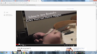
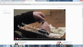
Our opening sequence includes our names, and footage of the killer preparing for his next victims, the image to the left shows the killer looking at photos of us and the knife makes it look serious. This high angle represents the girls in the photos to have less power than the man holding the photo. The title sequence also gives a clue to what the plot is as you can see it will be about the girls in the photos and he is some kind of stalker/killer with a knife, which he is cleaning, this could mean that he has used it before. Similarly to the Cabin In The Woods title sequence, we used text over the clip to set the tone.
It also looks like the start of a horror film as the audience can see the man putting the mask on and preparing to go out, to possibly kill. Throughout the title sequence there is an even pace and tense music which gets faster till the end, where it ends quite suddenly on the name of our film, the music is used instead of diegetic sound as there would only be silence.
The props used during the title sequence include: a knife, chloroform bottle, cloth, a buff, and photos. These are all used to create the illusion of mystery as it is meant to make the audience guess what will happen in the film as the sequence tells a short story.
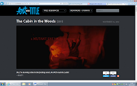
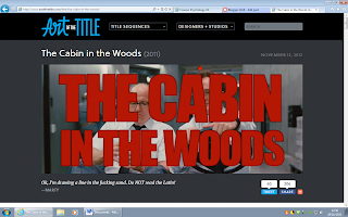
The opening sequence ends on our title as we need to tell the audience the title of the film, which is similar to The Cabin In The Woods. It is centered in the middle, in all capitals and red as this is a convention of a horror film, it is seen as dark and ominous and tells the audience that the film isn't going to be a happy one. The rest of the font is in white and is over the top of the action so there is still something to see whilst reading.


 Our opening sequence includes our names, and footage of the killer preparing for his next victims, the image to the left shows the killer looking at photos of us and the knife makes it look serious. This high angle represents the girls in the photos to have less power than the man holding the photo. The title sequence also gives a clue to what the plot is as you can see it will be about the girls in the photos and he is some kind of stalker/killer with a knife, which he is cleaning, this could mean that he has used it before. Similarly to the Cabin In The Woods title sequence, we used text over the clip to set the tone.


No comments:
Post a Comment