Monday, 22 April 2013
Friday, 19 April 2013
Evaluation - How did you attract/address your audience?
Once we had decided that our film genre was horror and that our film would have a 15 certificate we decided that our target audience would be aged between 15 and 35 and both genders. We also decided that our film would be set in Yorkshire and so we thought our target audience would be mostly from Yorkshire.
We then conducted research into similar films which we thought our audience would enjoy (for example i analsyed a scene from The Lovely Bones). From this we noticed things such as that they used loud sound effects to make the audience jump or feel tense and so we used this in our film (we used drone sounds in our film). I think that this was a more succesful element of our film.
 |
| This picture is from The Lovely Bones scene that i analysed. |
 |
| Softboxes for articifial light. |
However a less succesfull element of our film was the lighting. Making it dark was something that our audience suggested that we did. This was because we had to film in daylight in order for the camera to pick us up. To improve this we could use softboxes when filming, however these are expensive and we did not have a large budget.
Generally our feedback was good and so i think that our film did please our target audience and therefore appealed to them.
Monday, 15 April 2013
Monday, 8 April 2013
Our Preliminary Exercise
This is our Prelim Exercise that we made before our film. This taught us about the 180 degree, match on action and also shot reverse shot.
Sunday, 7 April 2013
Evaluation - Target Audience
As a group we decided that our target audience were aged 15 to 35 and were both male and female. As the characters in our film were very simple (they showed no signs of hobbies or subcultures etc), our film was not targeted at a more specific group of people. We felt that the less specific our target audience was then the more likely our film would be successful because it would be relevant to more people.
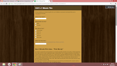 During pre-production we made an online form to question our audience about themselves, our story line and other things such as where they think our film would be shown. After gathering the responses we understood that our audience liked our story line, thought our chosen certificate was suitable and also would watch our film at the cinema. A few people also said that they would expect to see our film on TV, which we did not expect.
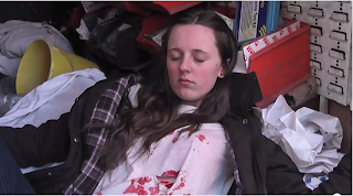 From this we decided not to change our story line (we had previously been worried that it was too childish) and also work with a 15 certificate by putting a swear word into the script and showing a bloody injury. We also found that the majority of our audience were from Yorkshire and so we decided to keep our Yorkshire accents, rather than try to hide them, when acting. The main reason that we would have changed our accents would have been so that people from other areas would have been more likely to understand us.
 During pre-production we made an online form to question our audience about themselves, our story line and other things such as where they think our film would be shown. After gathering the responses we understood that our audience liked our story line, thought our chosen certificate was suitable and also would watch our film at the cinema. A few people also said that they would expect to see our film on TV, which we did not expect.
 From this we decided not to change our story line (we had previously been worried that it was too childish) and also work with a 15 certificate by putting a swear word into the script and showing a bloody injury. We also found that the majority of our audience were from Yorkshire and so we decided to keep our Yorkshire accents, rather than try to hide them, when acting. The main reason that we would have changed our accents would have been so that people from other areas would have been more likely to understand us.
Evaluation - How Does Your Media Product Represent Particular Social Groups?
To answer this question i have made a video and voiced over images/screen shots to show how our two social groups (men and young girls) have been represented.
Evaluation - Codes and Conventions (for our Genre) In Our Title Sequence
When doing my research into title sequences (from our genre of horror) i found the film Crave on artofthetitle.com.
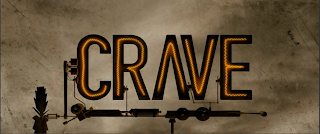 From this i noticed that they used their title sequence for 3 main purposes; to inform the audience about who was involved with the film (e.g actors, the director etc), to set the atmosphere of the film and to give the audience hints about what will happen in the film.
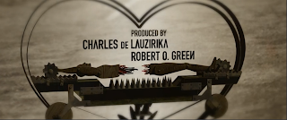
To the right you can see that we used our title sequence in the same way as Crave. This is because we have shown a knife being cleaned and also revealed who edited the film. The knife is an important prop in our film as it is the weapon used to kill Amy. The knife therefore gives a hint to what is going to happen in the film. Other important props appear within our title sequence (e.g photos of the girls) and so i believe that it is important to include these to help engage the audience.
Crave used music to create a tense atmosphere for their audience due to it being a horror/thriller film. The music that they used was quite up tempo and had unique sound to it. In comparison, the music that we used was also upbeat however it was a piano solo and so was not very unique. Our choice of music did set a tense atmosphere though, due to it being mostly high pitched. Both our's and Crave's music faded out to silence at the end title which also added to create a tense atmosphere. I therefore think that a tense atmosphere is a general convention of horror films.
 From this i noticed that they used their title sequence for 3 main purposes; to inform the audience about who was involved with the film (e.g actors, the director etc), to set the atmosphere of the film and to give the audience hints about what will happen in the film.
To the right you can see that we used our title sequence in the same way as Crave. This is because we have shown a knife being cleaned and also revealed who edited the film. The knife is an important prop in our film as it is the weapon used to kill Amy. The knife therefore gives a hint to what is going to happen in the film. Other important props appear within our title sequence (e.g photos of the girls) and so i believe that it is important to include these to help engage the audience.
Crave used music to create a tense atmosphere for their audience due to it being a horror/thriller film. The music that they used was quite up tempo and had unique sound to it. In comparison, the music that we used was also upbeat however it was a piano solo and so was not very unique. Our choice of music did set a tense atmosphere though, due to it being mostly high pitched. Both our's and Crave's music faded out to silence at the end title which also added to create a tense atmosphere. I therefore think that a tense atmosphere is a general convention of horror films.
1. In what way does your media product use, develop or challenge forms and conventions of real media products?
Our opening sequence was mainly influenced by the opening sequence for the film Se7en, which relates to ours as it focused on one main character and the credits.
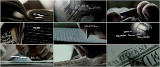
 It includes the casts names and the directors etc. The footage shown is that of the murderer cleaning his knife, and preparing his chloroform. It had to be suitable for the horror genre and therefore included athe clothing of a mask on the man and a knife, the main features were the props used that held significance as they were going to be used later on in the film. The role of an opening sequence is to introduce you to the characters, via introductions that can be shown through dialogue and text. Each character spoke and had a fair amount of screen time to introduce you to them and the text showed their names and who they played.
The narrative was straight forward and concentrated on Amy being kidnapped and the other two girls being left to fend for themselves. The credits appeared first, and this gave you a chance to understand the murderer and it gave you an insight on what's to come.
 The extreme close ups of the murderers hands allowed the audience to focus on every detail and investigate what he was doing. The editing showed his actions in slow motion and each shot lasted around four seconds to give the audience a chance to read the credits.
The music is tense and non-diegetic and builds up tempo until the end where it stops abruptly to make the audience focus on what is to come.
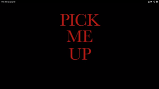
The typography of the title was red which is a symbolism of danger and horror and definitely represents this through the idea of blood.


 It includes the casts names and the directors etc. The footage shown is that of the murderer cleaning his knife, and preparing his chloroform. It had to be suitable for the horror genre and therefore included athe clothing of a mask on the man and a knife, the main features were the props used that held significance as they were going to be used later on in the film. The role of an opening sequence is to introduce you to the characters, via introductions that can be shown through dialogue and text. Each character spoke and had a fair amount of screen time to introduce you to them and the text showed their names and who they played.
The narrative was straight forward and concentrated on Amy being kidnapped and the other two girls being left to fend for themselves. The credits appeared first, and this gave you a chance to understand the murderer and it gave you an insight on what's to come.
 The extreme close ups of the murderers hands allowed the audience to focus on every detail and investigate what he was doing. The editing showed his actions in slow motion and each shot lasted around four seconds to give the audience a chance to read the credits.
The music is tense and non-diegetic and builds up tempo until the end where it stops abruptly to make the audience focus on what is to come.
The typography of the title was red which is a symbolism of danger and horror and definitely represents this through the idea of blood.
2. How does your media product represent particular social groups?
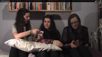 The three girls
represented teenage girls to be vulnerable; Amy becomes lost and kidnapped, she
can be seen to be weak and vulnerable. The other girls stay together and Kelsey
takes authority when she decides the two girls should search for Amy therefore
Kelsey may represent a stronger and wiser Teenage girl. The stereotype in a horror film for a teenage
girl is weak and vulnerable and Amy portrays this but if the film had been
longer, possibly one of the girls may have been stronger and challenged the
stereotype.
The girls represent teenagers
with their clothing, of jeans and trainers and they can be seen to represent Yorkshire
teenagers with their accents.
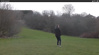
 The camera
angle of a wide shot of Amy on the field, shows her to be alone and represents
her vulnerability.
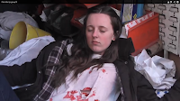
At the end there is a high angle shot which shows Amy to
look small against the killer once again representing her to be weak.
The man can be seen to represent men to be strong and powerful against women. The stereotype typically for the murderer in a horror film is strong and scary and he portrays this but if the film had been longer maybe the stereotype would’ve been broken and the girls may have won against him. The man’s clothing is that of a working man, therefore he represents a working man but him being a killer goes against this.
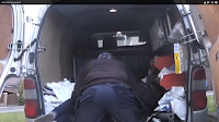 The mask he
wears makes him mysterious, it covers his identity and with the props of the
knife and chloroform he is dangerous and fits the stereotype of a murderer.
The camera
angle of the man throwing the girl into the van is a wide shot, this shot shows
his power and strength against her.
There is a
heavy breathing sound effect at the end is used for his voice and this
represents him to be dangerous and scary.
Saturday, 6 April 2013
7. Looking back at your preliminary task, what do you feel you have learnt in the progression from it to the full product?
Brief
Using the skills we learnt in the preliminary exercise for our main task
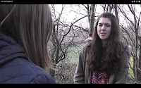
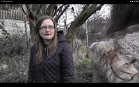
Improvements
We seemed to improve on the match on action as in the preliminary task there were many probems when editing, we couldn't get the shots to match and there were jump cuts. But when we edited the match on action in our main task it matched precisely and ran smoothly.
Other Method
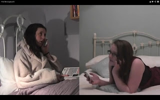
We used a split screen in our main task for when Amy and Kelsey are speaking to one another on the phone. We edited the shots so that the two girls are facing one another and look as if they are speaking to each other.
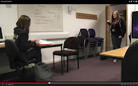 For the preliminary exercise we had to produce a continuity task that involved filming and editing of a character opening a door, crossing a room and sitting down in a chair opposite a other character, with whom she then exchanges a short conversation with. This task had to demonstrate match on action, shot/reverse shot and the 180-degree rule.
- For the main task we had to produce the titles and opening of a new fiction film, to last a maximum of two minutes.
Using the skills we learnt in the preliminary exercise for our main task
- We used the match on action technique- In our preliminary Kelsey held the door handle and then there was a close up shot of her opening the door. We used this technique in the main task for Darcey's phone call, Darcey picks up the phone in a wide shot and then there is a close up shot as she holds the phone to her ear.
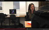
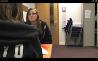 In our preliminary Kelsey and Amy had a shot/reverse shot conversation over there shoulders. We used this technique several times in the main task, once when Kelsey and Darcey are searching for Amy.

- In our preliminary Kelsey and Amy had a conversation with which they used the 180- degree rule, the camera didn't go over the line as otyherwise it would have caused confusion. We used this technique in the main task, for when Kelsey and Darcey are speaking to one another.
Improvements
We seemed to improve on the match on action as in the preliminary task there were many probems when editing, we couldn't get the shots to match and there were jump cuts. But when we edited the match on action in our main task it matched precisely and ran smoothly.
Other Method

We used a split screen in our main task for when Amy and Kelsey are speaking to one another on the phone. We edited the shots so that the two girls are facing one another and look as if they are speaking to each other.
Sunday, 31 March 2013
Evaluation: 1.
In what ways does your media product use, develop or challenge forms and conventions of real media products?
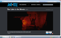
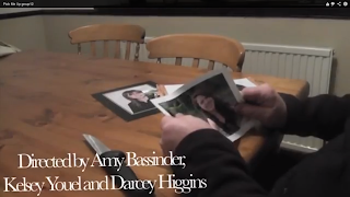
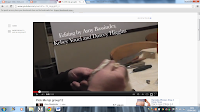 Our opening sequence includes our names, and footage of the killer preparing for his next victims, the image to the left shows the killer looking at photos of us and the knife makes it look serious. This high angle represents the girls in the photos to have less power than the man holding the photo. The title sequence also gives a clue to what the plot is as you can see it will be about the girls in the photos and he is some kind of stalker/killer with a knife, which he is cleaning, this could mean that he has used it before. Similarly to the Cabin In The Woods title sequence, we used text over the clip to set the tone.
It also looks like the start of a horror film as the audience can see the man putting the mask on and preparing to go out, to possibly kill. Throughout the title sequence there is an even pace and tense music which gets faster till the end, where it ends quite suddenly on the name of our film, the music is used instead of diegetic sound as there would only be silence.
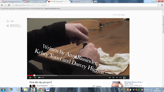
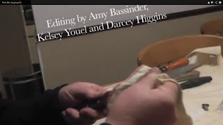
The props used during the title sequence include: a knife, chloroform bottle, cloth, a buff, and photos. These are all used to create the illusion of mystery as it is meant to make the audience guess what will happen in the film as the sequence tells a short story.
The opening sequence ends on our title as we need to tell the audience the title of the film, which is similar to The Cabin In The Woods. It is centered in the middle, in all capitals and red as this is a convention of a horror film, it is seen as dark and ominous and tells the audience that the film isn't going to be a happy one. The rest of the font is in white and is over the top of the action so there is still something to see whilst reading.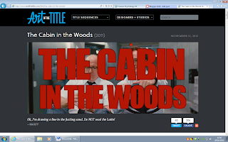

 Our opening sequence includes our names, and footage of the killer preparing for his next victims, the image to the left shows the killer looking at photos of us and the knife makes it look serious. This high angle represents the girls in the photos to have less power than the man holding the photo. The title sequence also gives a clue to what the plot is as you can see it will be about the girls in the photos and he is some kind of stalker/killer with a knife, which he is cleaning, this could mean that he has used it before. Similarly to the Cabin In The Woods title sequence, we used text over the clip to set the tone.
It also looks like the start of a horror film as the audience can see the man putting the mask on and preparing to go out, to possibly kill. Throughout the title sequence there is an even pace and tense music which gets faster till the end, where it ends quite suddenly on the name of our film, the music is used instead of diegetic sound as there would only be silence.

The props used during the title sequence include: a knife, chloroform bottle, cloth, a buff, and photos. These are all used to create the illusion of mystery as it is meant to make the audience guess what will happen in the film as the sequence tells a short story.
The opening sequence ends on our title as we need to tell the audience the title of the film, which is similar to The Cabin In The Woods. It is centered in the middle, in all capitals and red as this is a convention of a horror film, it is seen as dark and ominous and tells the audience that the film isn't going to be a happy one. The rest of the font is in white and is over the top of the action so there is still something to see whilst reading.

Saturday, 30 March 2013
Evaluation: 2.
How does your media product represent particular social groups?
The stereotypes we used in the film are the three teenage girls who are seen as stupid, weak and vulnerable as they go out to play a childish game of hide and seek when they shouldn't. This makes the man who kidnaps Amy look more powerful and be in control as he takes her so easily and kills her.
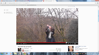
 However, Kelsey does also take control of the situation when she realises Amy isn't coming, she tells Darcey that they should go look for her as Kelsey takes on a worried motherly role. She is the strongest girl out of them and if the film had carried on, Kelsey's role may have developed and challenged the stereotypical role of the male serial killer and could have beaten him to become the one in control.
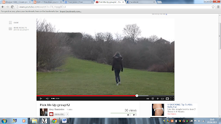
This wide angle shot of Amy, represents how alone and vulnerable she is as she has no one to help her.
This high angle shot at the end also shows Amy to be dead, as she was weak and couldn't fight off the killer who had all the power.
The clothing worn also represents who they are to the audience as some can relate, such as the girls, who all wear teenage clothing such as converse and jeans making them relatable to other teenagers. The killer seems to wear working clothes and a buff which covers his identity, creating a character that the audience are clearly meant to fear, (a stereotypical murderer).
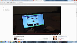 The heavy breathing used at the end is also meant to frighten and shock the audience to make them fear him as it is clear that he hasn't finished killing, and the darkness is also used to portray the mystery of who he is.
The stereotypes we used in the film are the three teenage girls who are seen as stupid, weak and vulnerable as they go out to play a childish game of hide and seek when they shouldn't. This makes the man who kidnaps Amy look more powerful and be in control as he takes her so easily and kills her.

 However, Kelsey does also take control of the situation when she realises Amy isn't coming, she tells Darcey that they should go look for her as Kelsey takes on a worried motherly role. She is the strongest girl out of them and if the film had carried on, Kelsey's role may have developed and challenged the stereotypical role of the male serial killer and could have beaten him to become the one in control.
This wide angle shot of Amy, represents how alone and vulnerable she is as she has no one to help her.
This high angle shot at the end also shows Amy to be dead, as she was weak and couldn't fight off the killer who had all the power.
The clothing worn also represents who they are to the audience as some can relate, such as the girls, who all wear teenage clothing such as converse and jeans making them relatable to other teenagers. The killer seems to wear working clothes and a buff which covers his identity, creating a character that the audience are clearly meant to fear, (a stereotypical murderer).
 The heavy breathing used at the end is also meant to frighten and shock the audience to make them fear him as it is clear that he hasn't finished killing, and the darkness is also used to portray the mystery of who he is.
Evaluation: 4.
I have created a powerpoint and have uploaded it to Slideshare for this evaluation question.
http://www.slideshare.net/darceyhiggins9/4-who-would-be-the-audience-for-your-media-product-18403228
http://www.slideshare.net/darceyhiggins9/4-who-would-be-the-audience-for-your-media-product-18403228
Evaluation: 5
How did you attract/address your audience?
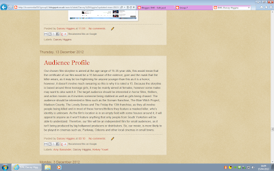
Our target audience was aimed at 15-35 year olds, so our film had to include features/conventions of a horror film that would be enjoyable for teenagers as well as adults. Using the BBFC website i researched into the contents of 15 films to see what our film is allowed to include and not include- 'Many horror films are rated 15. At 15 there can be strong threat and menace'
http://www.bbfc.co.uk/what-classification/15
We have also reached out to our audience and used appealing techniques for our audience by making it as realistic as possible, so we didn't use any special effects, we used a local normal location, wore outfits that teenagers would wear, used appropriate props and used conventions that would also scare our audience.
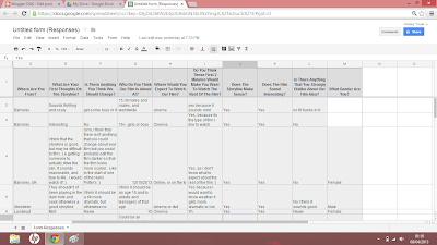 In the feedback sheet we created on what they thought of our 2 minute storyline we discovered that these realistic features appealed to our audience as one person put 'it sounds thrilling and scary', and another also put 'it sounds reasonable, and true to life'. They put this, as our description tells the audience that it is set in a local field, uses 3 normal teenage girls and uses a stalker, this could occur in real life.
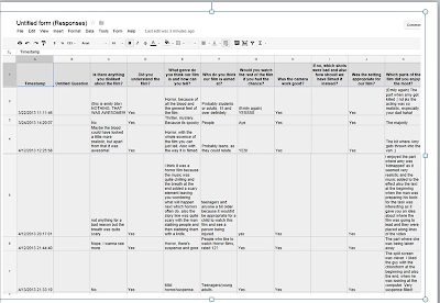
In our second feedback sheet that we created after we had finished our film, people have given good feedback and have commented with things such as that they liked 'the part when Amy was killed' and when 'Amy gets thrown into the van', they also thought the sound effect of the breathing was effective in scaring people.
However they have also given creative criticism of our film on what wasn't so successful and also given us ideas on how to improve. For example 'the blood could have looked a little more realistic' as we had to use fake blood from a shop and also mix our own using food colouring. We could have improved this by making sure the colour of the blood was more realistic coloured and looked better.

Our target audience was aimed at 15-35 year olds, so our film had to include features/conventions of a horror film that would be enjoyable for teenagers as well as adults. Using the BBFC website i researched into the contents of 15 films to see what our film is allowed to include and not include- 'Many horror films are rated 15. At 15 there can be strong threat and menace'
http://www.bbfc.co.uk/what-classification/15
We have also reached out to our audience and used appealing techniques for our audience by making it as realistic as possible, so we didn't use any special effects, we used a local normal location, wore outfits that teenagers would wear, used appropriate props and used conventions that would also scare our audience.
 In the feedback sheet we created on what they thought of our 2 minute storyline we discovered that these realistic features appealed to our audience as one person put 'it sounds thrilling and scary', and another also put 'it sounds reasonable, and true to life'. They put this, as our description tells the audience that it is set in a local field, uses 3 normal teenage girls and uses a stalker, this could occur in real life.
In our second feedback sheet that we created after we had finished our film, people have given good feedback and have commented with things such as that they liked 'the part when Amy was killed' and when 'Amy gets thrown into the van', they also thought the sound effect of the breathing was effective in scaring people.
However they have also given creative criticism of our film on what wasn't so successful and also given us ideas on how to improve. For example 'the blood could have looked a little more realistic' as we had to use fake blood from a shop and also mix our own using food colouring. We could have improved this by making sure the colour of the blood was more realistic coloured and looked better.
Evaluation: 7
Looking back at your preliminary task, what do you feel you have learnt in the progression from it to the full product?
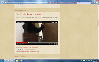 The brief we were working to for our preliminary task was to create a short continuity task that included the 180 degree rule, match on action and shot-reverse-shot. In this task we filmed and edited scenes of a character walking down a corridor, opening the door, walking in and sitting down opposite another character, a short conversation and finally walking out again.
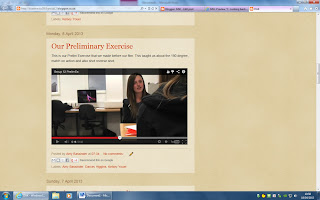 The brief for our main task was to make titles and the opening of a new fiction film that lasts a maximum of 2 minutes.
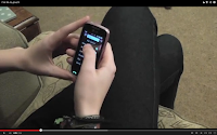
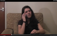 The skills we have learnt in our prelim exercise we have used in our 2 minute film: We used match on action in our prelim exercise for when Kelsey opened the door and then walked through, we also used it in our 2 minute film as shown, as i am holding the phone and then put it to my ear.
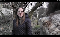
 We also used shot-reverse-shot in our preliminary exercise so we also used this in our film, as in our first exercise we used over the shoulder shots when Kelsey and Amy were talking to each other. We then used these shots in scenes in our film to show when conversations and their facial reactions are important such as when Kelsey and I are worried about Amy. This scene also uses the 180 degree rule as the camera didn't go over the line; this makes sure the scene looks right.
Improvements: We have got better at editing our film, as in the preliminary exercise we couldn't make the match on action flow properly as there were a few jump cuts when the action didn't match correctly. But then in our film we managed to edit it smoothly so the action flowed and we used match on action.
Other methods: We used a split screen when we edited our film so that we used something different and the phone conversation looked like it flowed. We changed the way Kelsey was looking so that it looked like a proper phone conversation and the girls seemed like they were looking/talking to each other.

 The brief we were working to for our preliminary task was to create a short continuity task that included the 180 degree rule, match on action and shot-reverse-shot. In this task we filmed and edited scenes of a character walking down a corridor, opening the door, walking in and sitting down opposite another character, a short conversation and finally walking out again.
  The brief for our main task was to make titles and the opening of a new fiction film that lasts a maximum of 2 minutes.
 The skills we have learnt in our prelim exercise we have used in our 2 minute film: We used match on action in our prelim exercise for when Kelsey opened the door and then walked through, we also used it in our 2 minute film as shown, as i am holding the phone and then put it to my ear.
 We also used shot-reverse-shot in our preliminary exercise so we also used this in our film, as in our first exercise we used over the shoulder shots when Kelsey and Amy were talking to each other. We then used these shots in scenes in our film to show when conversations and their facial reactions are important such as when Kelsey and I are worried about Amy. This scene also uses the 180 degree rule as the camera didn't go over the line; this makes sure the scene looks right.
Other methods: We used a split screen when we edited our film so that we used something different and the phone conversation looked like it flowed. We changed the way Kelsey was looking so that it looked like a proper phone conversation and the girls seemed like they were looking/talking to each other.

Friday, 22 March 2013
Pick Me Up Form
Now that our film is online we have made a response form so that our viewers can tell us what they think.
https://docs.google.com/forms/d/1e3quorfadLCHKPKyQQuqAXh2d0sDHV7lJAKA8GOSTRY/viewform
https://docs.google.com/forms/d/1e3quorfadLCHKPKyQQuqAXh2d0sDHV7lJAKA8GOSTRY/viewform
Friday, 15 March 2013
Progress Report 15/03/13
Time management:
We have now finished our filming and we are undergoing out editing, the blog is now finished as everything that needed to be included has been.
The filming took longer than we thought it would, it took us about three weeks due to weather conditions and timing issues as not all of our group could work at the same time due to commitments.
Next we will be complete our editing and will start paperwork for the evaluation of our film, and also finish our blog as we need to upload our finished film and a few other bits, like our evaluations.
Sunday, 3 March 2013
Analysis Of Phone Booth (First 15 min)
As we have to analyse the first 15 minutes of a film i have decided to look into Phone Booth. This is because in this film there is a mystery killer which the audience, as well as the characters, are trying to figure out who he is and so this makes this film similar to ours. This film also has a 15 certificate which is, again, similar to ours.The title 'Phone Booth' is simple and so the title alone already gives the audience a clue as to what the storyline of the flim involves.
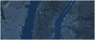 The film starts with a shot of space satellites, which then moves onto the earth and then begins to zoom in. However as it zooms into earth it fades into some kind of micro chip, rather than looking at towns or cities. As this is not what the audience are expecting, it stands out and so they will notice it. Whilst this is happening there is a non diegetic song added onto the scene with the word ‘operator’ being repeated multiple times. On top of this there is also a walkie-talkie sound effect. All of this together tells the audience that the film will have something to do with phones and so it therefore gives the audience clues to the storyline. The main reason it does this is because each of these things are very noticeable.
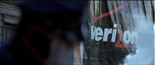
After this the camera zooms in and out of random things happening on the streets of New York. At this point the audience are not sure about what/who they should be focusing on. However all of these shots involve phones (for example on this screen shot 'Verizon' is the a company logo for an American phone network). Also there is no diegetic audio at this point (instead there is only non-diegetic music) which also does not help the audience to understand what is happening.
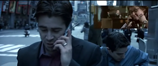 In the next few minutes this man participates in multiple phone calls and every time someone picks the phone up they are shown on screen talking back. This currently does not seem important but later the murderer, on the phone, is not shown and so the audience go from being able to see who the man is calling to being as clueless as he is. This alone helps the audience to empathize with the character due to them being on the same journey.
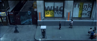 Once the man gets into the booth, the next shot is a long shot but from a high angle. This is an odd and random shot because the previous shots of this man have been mostly medium shots. Due to it being an odd shot the audience are more likely to notice it. This shot itself would suggest that someone is watching the man from a high angle.
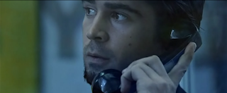 Later there is an eye line match from the man's point of view. As this follows his point of view the audience should have realized by this point that he is the main character. Also, the man is searching for the unknown person on the phone just like the audience. This again helps the audience to empathize with him.
The final shot i will discuss is an extreme close up of the mans face. This puts emphasis onto his frustration (his current emotion). The audience can therefore see how he is feeling and so have the chance to empathize with him again.
 The film starts with a shot of space satellites, which then moves onto the earth and then begins to zoom in. However as it zooms into earth it fades into some kind of micro chip, rather than looking at towns or cities. As this is not what the audience are expecting, it stands out and so they will notice it. Whilst this is happening there is a non diegetic song added onto the scene with the word ‘operator’ being repeated multiple times. On top of this there is also a walkie-talkie sound effect. All of this together tells the audience that the film will have something to do with phones and so it therefore gives the audience clues to the storyline. The main reason it does this is because each of these things are very noticeable.
After this the camera zooms in and out of random things happening on the streets of New York. At this point the audience are not sure about what/who they should be focusing on. However all of these shots involve phones (for example on this screen shot 'Verizon' is the a company logo for an American phone network). Also there is no diegetic audio at this point (instead there is only non-diegetic music) which also does not help the audience to understand what is happening.
A voice over of a man begins to state facts about phone booths. As the random shots stop we are left with this long shot of a phone booth. The voice over then reveals facts about this particular phone booth rather than general facts. This then signals to the audience that this is the phone booth that they need to focus on and so gives them another clue towards the story-line of the film.
The voice over then says that you (the audience) are about to see the last man to occupy the booth. In this shot there are two men shown in the centre of the shot. Centered characters are always the characters that the audience are supposed to focus on and so this would suggest that either of these two men are who the voice over is talking about. However you can only hear one speaking (the one in the red shirt) and so the audience should understand that he is the one who is being talked about.
 In the next few minutes this man participates in multiple phone calls and every time someone picks the phone up they are shown on screen talking back. This currently does not seem important but later the murderer, on the phone, is not shown and so the audience go from being able to see who the man is calling to being as clueless as he is. This alone helps the audience to empathize with the character due to them being on the same journey.
  Once the man gets into the booth, the next shot is a long shot but from a high angle. This is an odd and random shot because the previous shots of this man have been mostly medium shots. Due to it being an odd shot the audience are more likely to notice it. This shot itself would suggest that someone is watching the man from a high angle.
  Later there is an eye line match from the man's point of view. As this follows his point of view the audience should have realized by this point that he is the main character. Also, the man is searching for the unknown person on the phone just like the audience. This again helps the audience to empathize with him.
The final shot i will discuss is an extreme close up of the mans face. This puts emphasis onto his frustration (his current emotion). The audience can therefore see how he is feeling and so have the chance to empathize with him again.
From analyzing the opening of Phone Booth i have noticed that in order to make our audience empathize with our girl characters, then they need to be on the same journey as them. To do this we could use eye line matches and only reveal things that the girls can see (such as the text message). In our film we are wanting to show the murderer preparing to kill the girl and so in order for us not to reveal too much the the audience we could avoid showing his face. That way neither the audience or our girl characters would be able to recognize him (the murderer).
Another thing i have noticed is the simplicity of the title and I feel that it reveals the majority of the plot. I think that this is both a good and a bad thing. For example i think that the audience would be able to guess what the film is about and so would be likely to be disappointed. However, i also think that it may give away too much of the plot. If the film was to be called something relating to a phone, a phone booth or a phone line/network (but not too obvious) then this would leave a gap in the audiences mind which the film would then need to fill. I therefore think that the title of our film should be something clever which relates to something significant from our film.
Subscribe to:
Comments (Atom)


